Custom components
You can bring your own custom components inside the Toolpad editor.
The steps below explain how to create and use a custom component in Toolpad.
Create component
- Open the Component Library by hovering over it with your mouse.
- Click Create in the custom component section.
- Supply a name for your component in the dialog that opens. Click Create to initialize a new component.
- In the snackbar that appears, click the Open button. Your code editor will open with the newly created component.
Add component code
Toolpad exposes a createComponent function. This is used to signal to Toolpad which are the components that can be imported and how it should interpret the properties.
import * as React from 'react';
import { Typography } from '@mui/material';
import { createComponent } from '@mui/toolpad/browser';

export interface HelloWorldProps {
  msg: string;
}

function HelloWorld({ msg }: HelloWorldProps) {
  return <Typography>{msg}</Typography>;
}

export default createComponent(HelloWorld, {
  argTypes: {
    msg: {
      type: 'string',
      default: 'Hello world!',
    },
  },
});
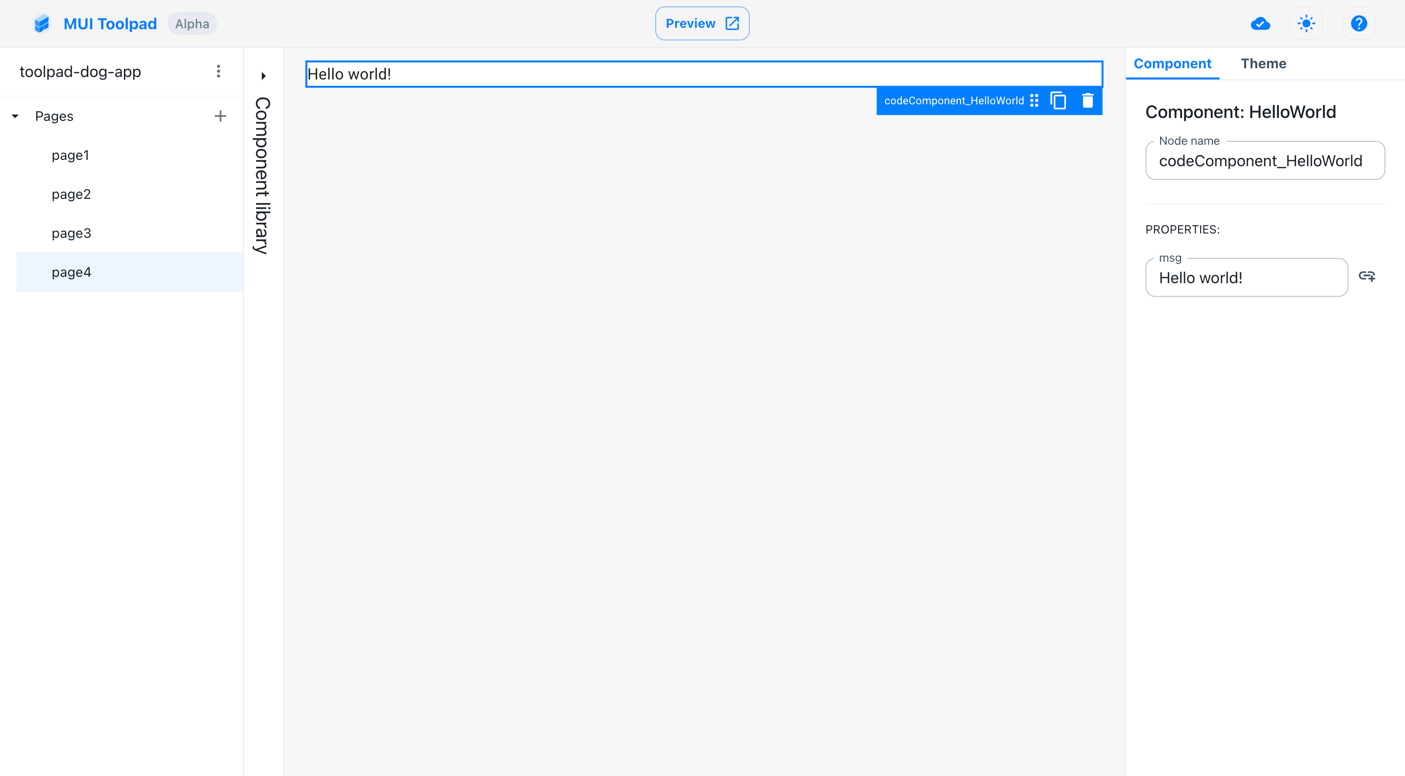
The props defined in the argTypes object are available as editable properties when inspecting the custom component:

Props of our custom component
Component Library
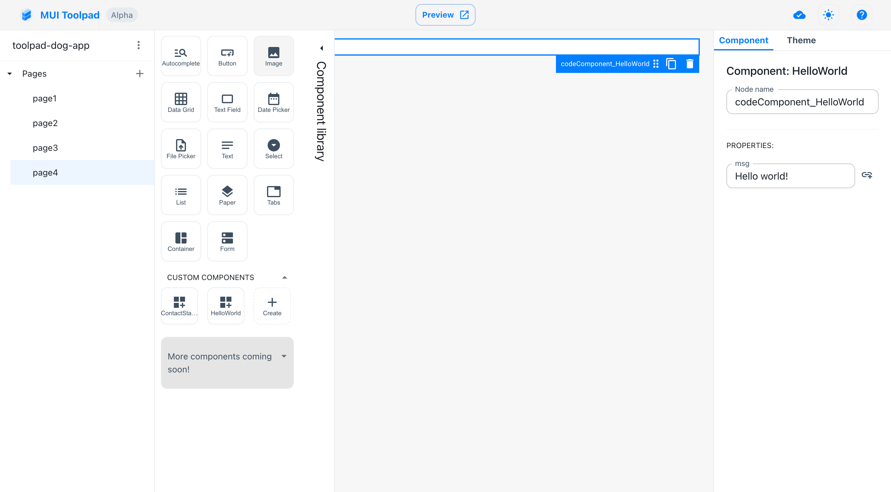
Custom components become available in the component library, alongside an option to create a new one. To use a custom component, drag it from the Component Library into the canvas. The component will be available under the Custom Components section.

Custom components in the library